Creating a Dialogue/Modal with Tailwind CSS: A Step-by-Step Guide

Welcome to AyyazTech! Today, we'll dive into how to create a dialogue or modal using the popular utility-first CSS framework, Tailwind CSS.
Before we begin, ensure you have a Tailwind CSS project setup. If you're unfamiliar with setting up Tailwind, you can refer to our comprehensive guide available on our YouTube playlist.
Step 1: Setting Up the Trigger Button
To begin with, let’s add a button to trigger our modal. We'll call it "Open Modal". Here's how you can style it using Tailwind:
<button class="px-4 py-2 rounded">Open Modal</button>Step 2: Designing the Modal Overlay
Every modal needs an overlay. This typically appears as a slightly darkened background that focuses user attention on the modal content. Here's how you can create one:
<div class="fixed left-0 top-0 bg-black opacity-50 w-screen h-screen"></div>Step 3: Crafting the Modal Structure
Within the overlay, let's design the actual modal. The modal will have a clean, white background and rounded corners:
<div class="bg-white rounded shadow-md p-8 mx-auto my-20 w-1/4">
    <!-- Modal content will go here -->
</div>
Step 4: Adding Icons and Text
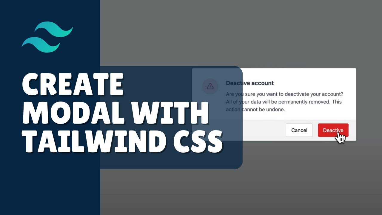
For demonstration, let's say our modal is a warning dialogue. We'll use an icon and some text:
- For icons, I recommend using Heroicons. It's an excellent resource by the makers of Tailwind CSS.
- For the message, let's include a heading and a paragraph warning the user about deactivating their account.
<div class="flex items-center gap-5">
    <div class="bg-red-200 rounded-full p-5 text-red-500 flex items-center justify-center w-10 h-10">
        <!-- Your SVG icon here -->
    </div>
    <div>
        <h1 class="font-bold text-lg mb-7">Deactivate Account</h1>
        <p>Are you sure you want to deactivate your account? All of your data will be permanently removed. This action cannot be undone.</p>
    </div>
</div>
Step 5: Modal Actions
Finally, let's add some action buttons to allow users to either confirm the action or cancel it:
<div class="flex justify-end gap-4 mt-5">
    <button class="bg-gray-100 border border-gray-300 px-6 py-2 rounded text-black hover:bg-gray-200">Cancel</button>
    <button class="bg-red-500 px-6 py-2 rounded text-white hover:bg-red-600">Deactivate</button>
</div>
Step 6: Implementing the Modal Logic
Using a little bit of JavaScript, you can now control the opening and closing of the modal:
function showDialog() {
    let dialog = document.getElementById('dialog');
    dialog.classList.remove('hidden');
    setTimeout(() => {
        dialog.classList.remove('opacity-0');
    }, 20);
}
function hideDialog() {
    let dialog = document.getElementById('dialog');
    dialog.classList.add('opacity-0');
    setTimeout(() => {
        dialog.classList.add('hidden');
    }, 500);
}
// Attach these functions to your button and modal overlay respectively.
Complete Code
<!DOCTYPE html>
<html lang="en">
<head>
    <meta charset="UTF-8">
    <meta name="viewport" content="width=device-width, initial-scale=1.0">
    <title>Modal with Tailwind CSS</title>
    <!-- Assuming you have set up Tailwind CSS in your project -->
    <link rel="stylesheet" href="path_to_your_tailwind.css">
    <style>
        /* Custom styles can go here */
    </style>
</head>
<body>

<!-- Trigger Button -->
<button class="px-4 py-2 rounded" onclick="showDialog()">Open Modal</button>
<!-- Modal Overlay and Content -->
<div id="dialog" class="fixed left-0 top-0 bg-black opacity-0 hidden w-screen h-screen transition-opacity duration-500" onclick="hideDialog()">
    <div class="bg-white rounded shadow-md p-8 mx-auto my-20 w-1/4">
        <div class="flex items-center gap-5">
            <div class="bg-red-200 rounded-full p-5 text-red-500 flex items-center justify-center w-10 h-10">
                <!-- Your SVG icon can be placed here -->
            </div>
            <div>
                <h1 class="font-bold text-lg mb-2">Deactivate Account</h1>
                <p>Are you sure you want to deactivate your account? All of your data will be permanently removed. This action cannot be undone.</p>
            </div>
        </div>
        <div class="flex justify-end gap-4 mt-5">
            <button class="bg-gray-100 border border-gray-300 px-6 py-2 rounded text-black hover:bg-gray-200" onclick="hideDialog()">Cancel</button>
            <button class="bg-red-500 px-6 py-2 rounded text-white hover:bg-red-600">Deactivate</button>
        </div>
    </div>
</div>
<script>
    function showDialog() {
        let dialog = document.getElementById('dialog');
        dialog.classList.remove('hidden');
        setTimeout(() => {
            dialog.classList.remove('opacity-0');
        }, 20);
    }
    function hideDialog() {
        let dialog = document.getElementById('dialog');
        dialog.classList.add('opacity-0');
        setTimeout(() => {
            dialog.classList.add('hidden');
        }, 500);
    }
</script>
</body>
</html>
And there you have it! A simple modal/dialogue using Tailwind CSS. If you found this guide helpful, please consider subscribing to our YouTube channel, AyyazTech, for more such content. Also, don’t forget to click on the bell icon to stay updated with our new videos. Like, share, and drop your feedback or questions in the comment section below.
Thank you for reading, and see you next time!