Crafting a Stunning Login Form with Tailwind CSS and Enhanced User-Friendly Validation
Introduction
Developing an intuitive and visually pleasing login form is an essential aspect of user experience design. Today, we'll dive into creating an eye-catching login form using Tailwind CSS, complete with enhanced JavaScript-based form validation to ensure user-friendliness.
Prerequisites
Before you start, you'll need to have the Tailwind CSS framework installed in your project. If you're new to Tailwind, make sure to check out our previous tutorials for a comprehensive guide on how to get started.
Getting Started
Once you've installed Tailwind CSS, run the following command in your terminal to watch for any changes in your input.css file:
npm run watchThis will actively compile your CSS files into an output.css file within the dist folder.
Basic Layout & Styling
Setting the Scene
To set the stage, let's create a light grey background. You can do this easily with the bg-gray-300 class.
Designing the Form Card
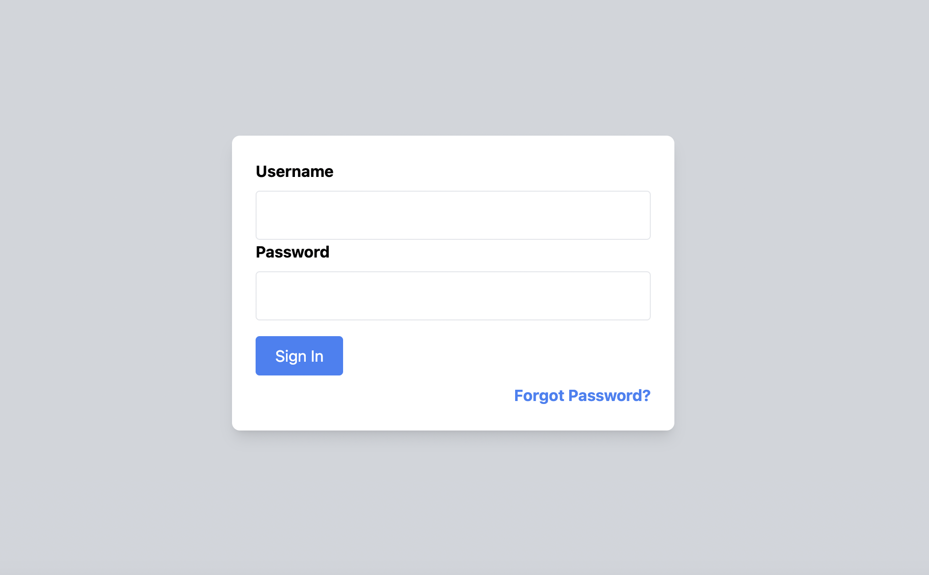
Next, you'll build a card to house your login form. Aim for a clean, rounded design with a white background and a drop shadow. We'll set the width at 450px and let the height adjust automatically. The Tailwind CSS code for the card will look like this:
<div class="bg-white rounded-lg shadow-lg w-[450px] h-auto">Remember to add flex justify-center items-center h-screen to your body element to center this card on the screen.
Input Fields: The Username and Password
Username Field
For the username, you'll need a label and an input element. Add appropriate padding and a bold label. Make sure the input field stretches across the entire width of the card:
<label class="block font-bold mb-2">Username</label>
<input type="text" id="username" class="block w-full p-3 border rounded">
Password Field
Follow the same pattern for the password input field, setting the input type to password:
<label class="block font-bold mb-2">Password</label>
<input type="password" id="password" class="block w-full p-3 border rounded">
Crafting a Beautiful Blue Sign-In Button
For an elegant touch, let's create a beautiful blue button that changes shade when hovered over. With Tailwind CSS, you can achieve this like so:
<button type="button" onclick="submitForm()" class="px-5 py-2 mt-4 rounded bg-blue-500 hover:bg-blue-600 text-white">
  Sign In
</button>
User-Friendly Form Validation with JavaScript
Now let's implement user-friendly form validation using JavaScript. In this example, the form checks for empty fields and provides real-time feedback.
Here's how the validation script would look:
function validateForm() {
  const username = document.getElementById('username');
  const password = document.getElementById('password');
  let isValid = true;

  if (!username.value.trim()) {
    username.classList.add('border-red-500');
    isValid = false;
  } else {
    username.classList.remove('border-red-500');
  }

  if (!password.value.trim()) {
    password.classList.add('border-red-500');
    isValid = false;
  } else {
    password.classList.remove('border-red-500');
  }

  return isValid;
}

function submitForm() {
  if (validateForm()) {
    alert('Form is valid. Logging you in...');
  } else {
    alert('Please fill in all the fields.');
  }
}
The Complete Code for Quick Copy-Pasting
Here's the entire code snippet that combines all the elements:
<!DOCTYPE html>
<html lang="en">
<head>
  <meta charset="UTF-8">
  <title>Login Form</title>
  <link href="./output.css" rel="stylesheet">
</head>
<body class="bg-gray-300 flex justify-center items-center h-screen">
  <div class="bg-white rounded-lg shadow-lg w-[450px] h-auto p-6">
    <form>
      <label for="username" class="block font-bold mb-2">Username</label>
      <input id="username" type="text" class="block w-full p-3 border rounded">

      <label for="password" class="block font-bold mb-2">Password</label>
      <input id="password" type="password" class="block w-full p-3 border rounded">

      <button type="button" onclick="submitForm()" class="px-5 py-2 mt-4 rounded bg-blue-500 hover:bg-blue-600 text-white">
        Sign In
      </button>
    </form>
    <a href="#" class="text-blue-500 font-bold mt-2 inline-block text-right w-full">
      Forgot Password?
    </a>
  </div>
  <script>
    function validateForm() {
      const username = document.getElementById('username');
      const password = document.getElementById('password');
      let isValid = true;

      if (!username.value.trim()) {
        username.classList.add('border-red-500');
        isValid = false;
      } else {
        username.classList.remove('border-red-500');
      }

      if (!password.value.trim()) {
        password.classList.add('border-red-500');
        isValid = false;
      } else {
        password.classList.remove('border-red-500');
      }

      return isValid;
    }

    function submitForm() {
      if (validateForm()) {
        alert('Form is valid. Logging you in...');
      } else {
        alert('Please fill in all the fields.');
      }
    }
  </script>
</body>
</html>
Conclusion
Tailwind CSS provides a streamlined approach for crafting visually appealing and functional user interfaces. We’ve explored how to create a beautiful login form complete with user-friendly, real-time form validation. Feel free to use this template as a starting point and further customize it to match your specific needs. Happy coding!